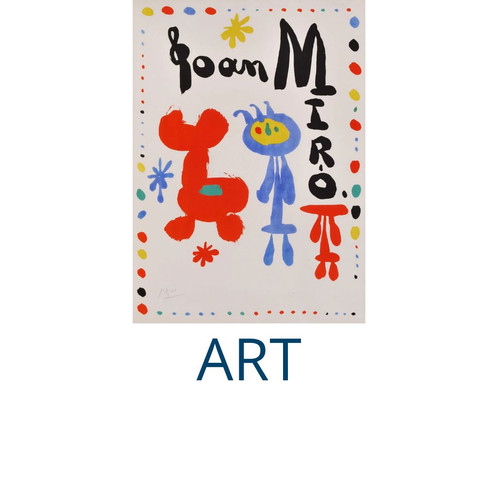

Poster tricks - Make eye contact
Share
Graphic designers intuitively grasp the emotional draw of eye contact and the human brain responds to images of eyes, even when they are hidden or distorted, such as in Richard Avedon’s 1967 “John Lennon” poster. A face can emerge from minimal ingredients, as evidenced in Paula Scher’s 1994 poster for “Him” at The Public Theater.
Make Eye Contact: The Power of Eyes in Graphic Design
The human brain is hardwired to recognize faces and respond to eye contact. In graphic design, this intrinsic connection can be harnessed to captivate viewers, evoke emotions, and create memorable compositions. Designers intuitively grasp the psychological pull of eyes and use them to direct attention, tell stories, and forge connections. Whether explicitly portrayed or suggested through abstraction, eyes hold a magnetic quality that resonates deeply with audiences.
This article delves into the art and science of using eyes in graphic design, examining iconic examples like Richard Avedon’s 1967 “John Lennon” poster and Paula Scher’s 1994 “Him” poster for The Public Theater. We’ll explore how designers use eye contact to evoke emotion, communicate meaning, and engage viewers across various mediums.
The Psychology of Eye Contact in Visual Communication
1. Biological Basis
From infancy, humans are drawn to faces and particularly to eyes. This instinct is rooted in evolutionary biology, where recognizing faces and interpreting emotions through eye contact was crucial for survival. The brain’s fusiform face area (FFA) is specialized for processing facial features, making eyes an especially potent element in design.
2. Emotional Resonance
Eye contact conveys a spectrum of emotions, from intimacy and trust to mystery and tension. In graphic design, images of eyes can evoke these feelings and draw viewers into the composition. Even when eyes are distorted, abstracted, or obscured, their presence triggers a subconscious response, compelling the viewer to engage.
3. Directional Cues
Eyes naturally guide attention. In design, the gaze of a depicted subject can direct viewers’ eyes to specific elements within the composition, creating a dynamic flow that enhances storytelling and visual hierarchy.
Iconic Examples of Eyes in Graphic Design
1. Richard Avedon’s “John Lennon” Poster (1967)
Avedon’s psychedelic portrait of John Lennon uses vibrant colors and kaleidoscopic patterns to transform the musician’s face into an otherworldly vision. The eyes, however, remain central, drawing the viewer into Lennon’s enigmatic expression. This poster exemplifies how eye contact can ground even the most surreal imagery, providing a focal point that anchors the composition.
View: https://www.avedonfoundation.org/archive/john-lennon-poster
2. Paula Scher’s “Him” Poster for The Public Theater (1994)
In her poster for Wallace Shawn’s play “Him,” Scher creates a face using minimal elements: bold typography and abstract shapes. The eyes, represented by simple ovals, command attention and evoke a sense of intrigue. This design demonstrates the power of suggestion, showing how a face can emerge from minimal ingredients while still capturing the viewer’s focus.
View: https://www.designobserver.com/feature/paula-scher-him/38615
3. Saul Bass’s “The Man with the Golden Arm” (1955)
Though not entirely focused on eyes, Bass’s work often uses abstract forms to imply human presence and emotion. In this poster, fragmented shapes suggest a face, and the tension is heightened by the absence of direct eye contact. The composition’s psychological depth invites viewers to complete the image in their minds.
View: https://www.moma.org/collection/works/67771
Techniques for Using Eyes in Graphic Design
1. Direct Eye Contact
Designs that feature subjects making direct eye contact with the viewer create an immediate and personal connection. This technique is effective for:
Posters: To grab attention and establish emotional resonance.
Advertisements: To build trust and appeal to consumer instincts.
Album Covers: To convey intimacy or provoke curiosity.
Example: Shepard Fairey’s “Hope” poster for Barack Obama uses direct eye contact to evoke confidence and optimism.
2. Implied Eyes
Eyes don’t need to be fully rendered to have an impact. Designers can use minimal shapes, lines, or abstract forms to suggest eyes, leaving the rest to the viewer’s imagination. This approach adds a layer of intrigue and engages the audience on a cognitive level.
Example: Paul Rand’s designs often hint at human features using abstract forms, creating a playful and engaging aesthetic.
3. Distorted or Obscured Eyes
Distorting or obscuring eyes can evoke mystery, unease, or other complex emotions. This technique is common in:
Movie Posters: To suggest psychological depth or suspense.
Album Covers: To convey avant-garde or experimental themes.
Editorial Design: To challenge viewers’ perceptions and invite interpretation.
Example: The poster for “A Clockwork Orange” (1971) features an exaggerated eye motif that adds to the film’s unsettling tone.
4. Eyes as Graphic Elements
Eyes can also be used as standalone graphic elements, detached from any face. This approach emphasizes their symbolic power and allows designers to experiment with repetition, scale, and placement.
Example: The surrealist movement often used disembodied eyes to explore themes of perception and identity, as seen in Salvador Dalí’s collaborations with designers.
Practical Applications of Eye Contact in Design
1. Advertising
Eye contact in advertising helps forge a personal connection between the product and the consumer. Whether it’s a model gazing directly at the viewer or an animal’s eyes drawing attention to a brand logo, this technique fosters engagement and trust.
Case Study: Coca-Cola’s “Share a Coke” campaign incorporated images of people making eye contact to create a sense of inclusion and friendliness.
2. Brand Identity
Incorporating eyes into logos or branding elements can make a brand memorable and approachable. For example:
CBS Logo: The iconic “eye” logo symbolizes surveillance and awareness, making it instantly recognizable.
Rolling Stone Magazine: The use of bold, seductive eyes on covers reinforces its edgy and provocative identity.
3. Poster Design
Posters rely on bold visuals to capture attention quickly. Featuring eyes or eye contact creates a focal point that draws viewers in and encourages them to explore the message further.
Example: The 1984 “1984” campaign poster by Apple featured a haunting eye motif, emphasizing themes of surveillance and control.
The Evolution of Eye Imagery in Design
1. Early Advertising
In the late 19th and early 20th centuries, early advertisements often featured detailed portraits with prominent eyes to evoke trust and human connection. For example, travel posters depicted alluring figures gazing out at potential travelers, inviting them to explore new destinations.
2. Modernism and Minimalism
The mid-20th century saw a shift towards abstraction and minimalism. Designers like Saul Bass and Paul Rand reduced faces to their essential elements, using eyes as key focal points.
3. Digital Age
Today, digital tools allow designers to manipulate eyes in innovative ways. From 3D rendering to interactive elements, the possibilities for incorporating eye imagery are virtually limitless.
Example: Augmented reality (AR) applications enable users to interact with designs that feature eye contact, creating immersive and engaging experiences.
Designing with Eyes: Dos and Don’ts
Do:
Use eyes strategically to guide attention and create focal points.
Experiment with abstraction and minimalism to add intrigue.
Consider cultural and emotional connotations when designing for diverse audiences.
Don’t:
Overuse eye imagery to the point of redundancy or discomfort.
Ignore the emotional impact of eye contact; ensure it aligns with your message.
Neglect technical considerations like resolution and placement, which can affect visual clarity.
Conclusion
Eyes are a powerful design element, capable of evoking emotion, guiding attention, and creating lasting impressions. Whether used explicitly or implied through abstraction, they resonate deeply with audiences, making them a valuable tool in any designer’s repertoire. Iconic works like Richard Avedon’s “John Lennon” poster and Paula Scher’s “Him” poster demonstrate the enduring appeal and versatility of eye imagery in graphic design.
By understanding the psychology of eye contact and experimenting with different techniques, designers can harness the emotional and visual impact of eyes to create compelling, memorable works