Joseph Binder: Streamlined Designs
Share
Joseph Binder – Austrian-American Artist Known for His Streamlined Designs - Poster Artist
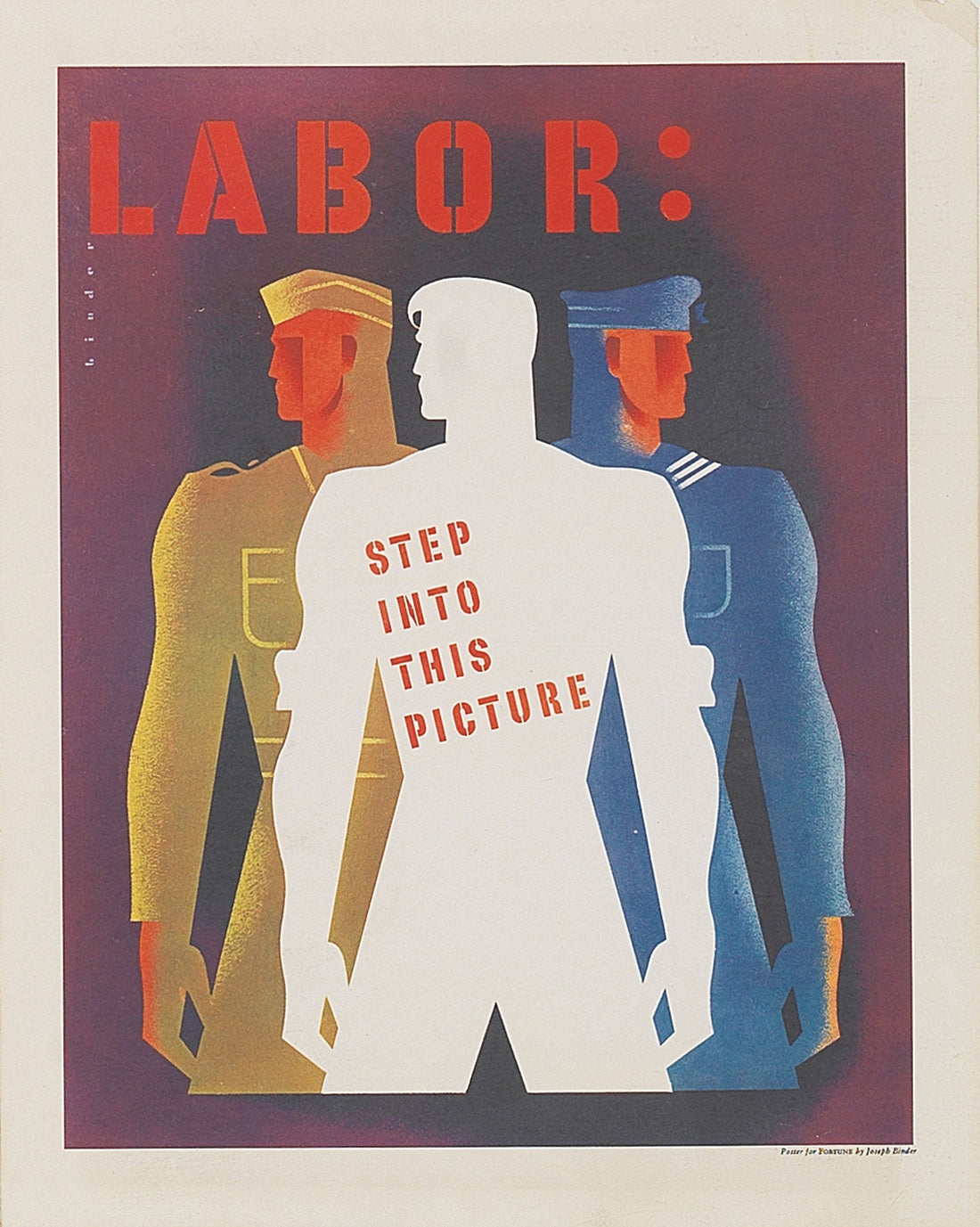
Joseph Binder (1902–1972) was an Austrian-American graphic designer whose distinctive style and streamlined approach to visual communication helped shape modern graphic design, particularly during the mid-20th century. Known for his clean, minimalistic, and often bold designs, Binder’s work bridged the gap between fine art and commercial illustration. His creative prowess led to collaborations with major corporations, as well as government projects, where his designs conveyed clear and effective messaging with sophistication and elegance.
This article will provide an in-depth look at Joseph Binder’s life, career, and significant contributions to design. We will explore his journey from Vienna to New York, his stylistic evolution, and the key elements of his work, which earned him recognition in the graphic design world. Additionally, we will analyze his most iconic posters and designs, focusing on how his streamlined approach influenced the design trends of the 20th century and continues to inspire today’s designers.
Early Life and Career of Joseph Binder
Joseph Binder was born on July 17, 1902, in Vienna, Austria. Growing up in the early 20th century, Binder was exposed to the dramatic changes in art, design, and culture that defined this period, including the rise of modernism. This influence shaped his early artistic development, leading him to pursue formal training in the arts. He studied at the prestigious Academy of Fine Arts in Vienna and initially trained as a painter. However, Binder quickly shifted his focus to commercial art and graphic design, finding his true calling in creating visual narratives that merged form and function.
By the late 1920s, Binder had started gaining recognition as a talented illustrator, and his work began to appear in a variety of publications. His early design aesthetic was influenced by the geometric shapes and clean lines of the Bauhaus movement, which emphasized functionality and simplicity. It was during this period that Binder’s distinct visual voice started to emerge, characterized by a harmonious combination of abstract forms and representational imagery.
Moving to the United States: A Turning Point in Binder’s Career
In 1936, Joseph Binder emigrated from Austria to the United States, escaping the rising political instability in Europe. He settled in New York City, where he would spend much of the rest of his career. Binder’s move to America marked a major turning point in his career, both creatively and professionally. It was here that his streamlined style would truly flourish, and he would become known as one of the most influential graphic designers of his time.
Upon his arrival in the U.S., Binder quickly adapted to the dynamic and fast-evolving design culture in New York. The city, known for its vibrant arts scene and burgeoning design industry, provided Binder with ample opportunities to showcase his skills. He began to work on a variety of high-profile design projects, from advertisements to corporate branding, and soon became a sought-after designer. His designs were clean, bold, and immediately recognizable, embodying the spirit of modernism with their minimalism, sharp lines, and use of color.
Binder’s early American work was also influenced by the popularity of Art Deco and streamlined design, both of which emphasized geometric shapes and modern aesthetics. This influence can be seen in his many poster designs, where he combined vivid colors and simple, dynamic compositions to create attention-grabbing visuals.
Joseph Binder’s Streamlined Design Philosophy
Binder’s design philosophy was rooted in clarity, simplicity, and effective communication. His designs were defined by streamlined visuals that eliminated unnecessary embellishments, focusing instead on the core message. He embraced modernist principles such as asymmetry, flat colors, and geometric abstraction, making his designs both aesthetically pleasing and functional.
One of the key aspects of Binder’s approach was his use of abstraction to convey meaning. His designs often combined recognizable images with abstract forms, creating a visual language that was both striking and easy to understand. This approach made his work particularly effective for advertising and public communication, where clarity and immediacy were paramount.
Another significant feature of Binder’s work was his innovative use of typography. He often employed bold, sans-serif fonts in his designs, enhancing the legibility and impact of his messaging. His typography was always well-integrated with the overall composition, creating a harmonious balance between image and text.
Binder was also known for his ability to work across different media, from posters to magazine covers, brochures, and advertisements. His designs were versatile, able to adapt to different formats while maintaining the same visual impact. This adaptability allowed him to work with a wide range of clients, from commercial enterprises to government agencies.
Key Works and Iconic Poster Designs
Joseph Binder’s career as a designer spanned several decades, and throughout this time, he produced numerous iconic posters and designs. His posters, in particular, became some of his most celebrated works, admired for their boldness, simplicity, and modernity.
Poster for the 1939 New York World's Fair
One of Binder’s most notable early American works was the poster he created for the 1939 New York World's Fair. The poster, titled “Building the World of Tomorrow,” was an embodiment of the fair’s futuristic vision. It featured a streamlined, almost abstract rendering of the globe, surrounded by geometric shapes and bold typography. The poster perfectly captured the essence of the fair, which aimed to showcase innovations in science, technology, and industry.
Design Elements: The use of clean, flowing lines and a bold, simple color palette helped communicate the theme of progress and modernity. The iconic globe in the center of the poster was a symbol of global unity and a forward-looking future.
Image URL: 1939 New York World's Fair Poster
Poster for United Airlines (1940s)
In the 1940s, Binder created several posters for United Airlines, reflecting the streamlined, modern aesthetic that characterized his design philosophy. His posters for the airline often featured stylized depictions of planes, with dynamic lines and bold, colorful backgrounds that conveyed speed and efficiency. These designs were not just advertisements; they were visual expressions of the excitement and glamour associated with air travel in the mid-20th century.
Design Elements: Binder used angular lines and simplified shapes to emphasize the motion and power of the airplane. The use of red, white, and blue created a strong patriotic connection to the American brand while maintaining a sleek, modern appearance.
Image URL: United Airlines Poster
Public Service Posters During World War II
Another area where Joseph Binder’s design talents were widely recognized was in the production of public service posters during World War II. Binder was commissioned by the U.S. government to create posters encouraging Americans to conserve resources, support the war effort, and contribute to the national morale. His designs for these posters were highly effective, combining powerful visual imagery with direct, clear messaging.
Design Elements: Binder’s wartime posters often featured simplified, stylized figures and objects that conveyed the urgency and importance of the message. His use of large, legible fonts, alongside minimal imagery, made his posters both impactful and easy to read from a distance. His most famous poster from this period is “Loose Lips Might Sink Ships,” which is still considered a classic example of wartime propaganda design.
Image URL: Loose Lips Might Sink Ships Poster
Legacy and Influence
Joseph Binder’s streamlined, modern designs have left a lasting impact on the field of graphic design. His ability to combine simplicity with effective communication made him a pioneer in the use of minimalism within commercial design. His work was not only influential in the U.S. but also had a significant impact on the international design community, particularly in Europe, where his style resonated with the modernist ideals that were taking root.
Binder’s approach to design—characterized by abstraction, simplicity, and clarity—continues to inspire contemporary designers, particularly in the fields of advertising and branding. His use of geometry, bold colors, and effective typography remains a benchmark for designers striving for clarity and elegance in their work.
---
Conclusion
Joseph Binder’s streamlined designs have become synonymous with mid-century modernism, blending the worlds of fine art and commercial design. His approach to graphic design, which emphasized clarity, minimalism, and effective communication, was groundbreaking and influential, shaping the visual language of the 20th century. From his iconic posters for the 1939 World's Fair to his work during World War II and his enduring legacy in commercial design, Binder’s contributions continue to inspire graphic designers and visual communicators around the world.
Through his work, Joseph Binder demonstrated that design could be both functional and beautiful, practical and artistic. His legacy endures through his posters, advertisements, and designs, which continue to stand as examples of timeless, effective visual communication.
---
References and Sources
"Joseph Binder: Streamlined Designs," The Museum of Modern Art. https://www.moma.org
"Joseph Binder and the World of Graphic Design," Graphic Design History. https://www.graphicdesignhistory.com
"Joseph Binder Posters: A Legacy of Modern Design," Poster House. https://www.posterhouse.org
"Joseph Binder: World War II Poster Design," Library of Congress. https://www.loc.gov


